Screening and Diagnostics
The Climate Hazards Center has developed a number of screening processes to quality control inputs and diagnostic tools to evaluate the various aspects of CHIRP and CHIRPS. The various screening routines and resulting products are described in more detail below.
Screening and Diagnostics
Screening
Screening processes are designed to test station inputs to the CHIRPS process, and identify potentially bad data. There are a number of different quality control standards used to identify suspicious data, and remove it from the processing stream before it goes into the CHIRPS process. These tests, and any available outputs or results, are explained below.
Identify False Zeros
The daily GTS and GSOD values undergo screening to flag potentially missing values coded with zeros. This is a substantial problem with both of these information sources and can produce inaccurate low values in the midst of a rainy season, as missing data are coded as zeros and passed through the automated GSOD and GTS networks. If a daily GSOD or GTS value is zero for a given day, but the daily CHIRP precipitation estimate is above the long-term (1981-2014) average daily rainfall intensity at that pixel, that daily station value is treated as missing instead of zero.
Identification of False Duplicates
Some GSOD data are found to exhibit repeating values of meaningful rainfall (greater than 10mm) on consecutive days. For example, a string of daily observations might be: 0.0000, 0.0000, 87.653, 87.653, 0.0000, .... If a monthly GSOD record has three pairs of repeated values, or the amount of precipitation being duplicated (i.e. the sum of the repeated values) is greater than 30 mm in a month, the monthly record is omitted. A map of these locations is available for every month here (https://data.chc.ucsb.edu/products/CHIRPS-2.0/diagnostics/GSOD_dups_pngs/).
Maps of Quality Control Excluded Stations
For each new run of CHIRPS, a number of quality control steps are performed. During this process, maps are made showing the location and number of points excluded due to:
Bad Z-score: a Z-score value more extreme than +/- 4.0.
False Zeros: Station reports a zero, but CHIRP > 7mm for a pentad, or 20mm for a month.
Extreme Values: Station value greater than 2000mm, or greater than 5 times CHIRP (with CHIRP being > 20mm).
The monthly maps can be found here:
The pentad maps can be found here:
In each of these directories, the file names for the products identified above should be self-evident. Bad Z-score maps are listed as “bad_zscores.YYYY.MM.png”, where YYYY is the 4-digit year, and MM is the 2-digit month. The false zeros product are listed in the appropriate directory as “false_zeros.YYYY.MM.png”, and the extreme values product is identified as “stn.gt.5xchirp.YYYY.MM.png”. These graphics identify the number and location of stations which were flagged by the listed quality control test.
Station Comparison
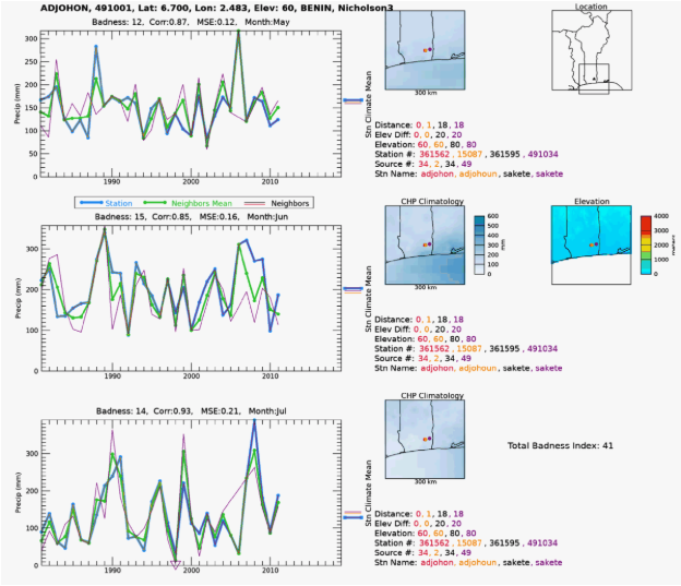
As part of our quality control effort, when we ingest new sources of station precipitation time series, we compare each new station to other stations previously ingested into our database. We want to weed out stations that are statistically and/or visually different from their neighbors. To this end, we have developed software that calculates correlation and difference statistics to produce an index that we can use to rank the goodness-of-fit with the neighboring stations. We also generate graphics that display the time series of the station with the neighboring stations’ time series. This allows us to visually inspect stations where the statistics suggest a poor fit with its neighbors during that station’s wettest 3-month period. Individually, we examine the plots and flag those that we suspect may contain erroneous data. We include information about elevation, climatology, geographic locations, and station sources in the plots so that we can determine if the differences we see can be explained by these other variables. See the example plot below.
The algorithm selects a station from our precipitation database for a given source and searches for neighbor stations within an increasing radius from the station until a minimum number of "quality" stations is found. This number is usually four, but it can be adjusted if stations are sparse in the area of interest. A quality station has enough observations (5-15 depending on the data set's temporal length) within the time series of interest. For CHIRPS, we are interested in the time period 1981 to present. At each search iteration, if the minimum number of quality stations is not found, the search radius is increased up to a maximum of 150km. If the minimum is not met at the maximum search radius, then the station is skipped and noted in a log file. When enough quality neighbors are found, the distance weighted mean (DWM) of the neighbors is calculated, and the correlation coefficient (R) and the difference between the station and the DWM are calculated. The difference is then divided by the DWM to express that as a fraction of average error (FAE). These values are used to compute a composite index of the overall "badness" of the station compared to the neighbor's DWM. The badness index (BI) is calculated with:
BI = (1.0 - max(R, 0.0) + min(FAE, 10.0)) * 50.0
The BI is calculated for the 3 wettest months at the station location and added together to produce a "total badness index" (TBI) for each station. The time series of the station (blue), and its neighbors (distance-weighted line thickness), is plotted along with the DWM (green) for each of the wettest three months. Each of these graphics contains the latitude and longitude, elevation, country name, and source name of the station. The nearby stations’ distances from the compared station, differences in elevation, station, source IDs, and station names are listed to the right of each time series plot in order of distance to the station. These values are color-coded to match the color of the time series plot line. A plot of the locations of each station selected within a 150 km radius is generated and color coded to the upper-right of each time series plot. The station under examination is plotted in the middle as a triangle, and the neighbors are plotted geographically around it. The climatological precipitation value (CHPclim) for each station is plotted along the right side of each plot as a reference to use in determining station validity. The boundary country the station is located in is plotted in the upper right of the graphic, along with its location and the outline of the station location box for reference. Below this is a colorized elevation map of the searched area to help determine if the topography is affecting the station comparisons. In the lower right corner of the plot, the TBI is printed. The names of these graphics files are prepended with the TBI to allow for numerical sorting by the computer’s file system. Typically, only stations with TBI greater than 100 are saved for viewing, since TBI values below that are stations are in very good agreement with their neighbors.
Reality Checks
The Reality Checks (R-Checks) process is a hands-on approach that helps enable a quality product for hazards monitoring and other scientific activities. In R-Checks, we examine the data visually via the Early Warning Explorer and statistically using calculated statistics. Ancillary information, such as FEWS NET data sets, news reports, and government meteorological reports, is frequently used in the process. The R-Checks process has been successful in: 1) Validating anomalous wet and dry events around the world as shown by CHIRPS, 2) catching inaccurate station reports that would have otherwise negatively influenced the data set, such as creating false droughts, 3) checking that the semi-automated flow of CHIRPS data creation is working correctly, 4) identifying weaknesses and strengths of the algorithm and data inputs, which helps in planning improvements for future versions.
As part of this process, a unique collection of images are made available through EWX. This product displays the value of stations on top of the CHIRPS map to identify values that may not align with neighboring stations or the underlying CHIRPS estimates. It can be used to identify false station data, as well as agreement between stations and the CHIRPS fields. A team of data analysts quality checks each month’s station-overlay images to identify stations that are suspect or should be eliminated before the final release of CHIRPS. A report of this R-Checks effort is available on the CHC Wiki page each month. This report contains information that CHIRPS users may find helpful; for example, users can find notes about major rainfall events shown by the data, and validation for some. Users can utilize the CHC EWX viewer to explore these images combining stations and CHIRPS.
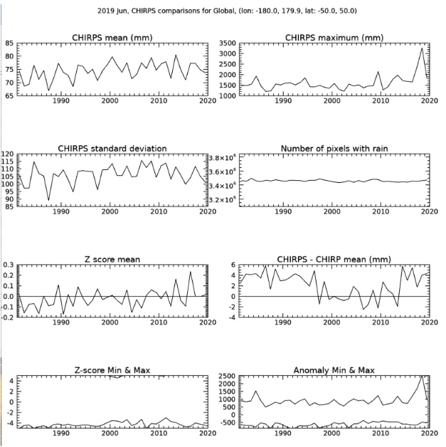
In addition to the station-overlay images, analysts also examine several measures of the new CHIRPS values over the entire time series for consistency. For an individual month, regional and global statistics means are plotted for the CHIRPS values, maximum value, standard deviation, number of pixels with rain, Z-score mean, the difference between CHIRPS and CHIRP, and the Z-score and anomalies minimum and maximums in that region for the current month. A sample graphic is below, and other sample graphics can be found here.
Diagnostics
In addition to the previously mentioned products used to quality control station data each month, we have also developed a number of diagnostic products, which make the CHIRPS process more transparent. These have proven helpful for the assessment of the product over specific countries or regions. What follows is a brief description of a number of these different diagnostics.
Global Station Density
For every month, we provide GeoTiff files of the number of stations within each pixel for 0.05-degree resolution and 0.25-degree resolution. This product is useful for the identification of station-rich and station-poor regions of the globe. The GeoTiff files are available for download here, where you can select the resolution of interest (0.05-degree or 0.25-degree).
In addition to the spatial representation of the global data, we also make available two types of products that capture the station inputs, in different ways.
The first product gives all the locations and monthly totals of non-proprietary stations available as potential inputs to CHIRPS. This collection is everything available prior to the screening routines, and so some information in these files may have been flagged as bad data, duplicates from other sources, too large or false zeros, and may not make it into CHIRPS. You can find the files with this information for every month here.
A second product gives the locations, but not the values, of all the stations (both non-proprietary and proprietary) that make it into the CHIRPS final product. These files are available here. In this directory you can find files named “global.stationsUsed.YYYY.MM.csv” which cover the full time series of CHIRPS, and only stations which were available in the historical record at the time of the release of CHIRPS in 2015. Additional stations made available after the initial release are also available in a similar format, but named “extra.stationsUsed.YYYY.MM.csv”. For periods after 2015 you can combine the two files to find the complete list of station locations making their way into CHIRPS.
Stations by Country
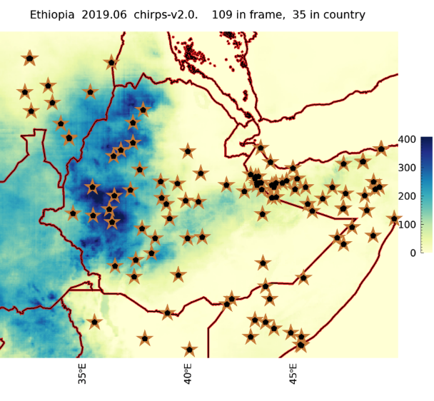
There are two diagnostic products to evaluate stations going into CHIRPS for an individual country. The first is a map of the stations' locations falling within a country’s boundaries, as well as neighboring areas, for every month of the historical record. You can find a listing of the mapped countries here, and then click on the country of interest to find the map for each historical month. At the top of each graphic there is also a count of the number of stations within the country, and in the mapped area (including the country’s surrounding regions) for reference. This is an example of one of the maps, displaying station support for Ethiopia in June 2019.
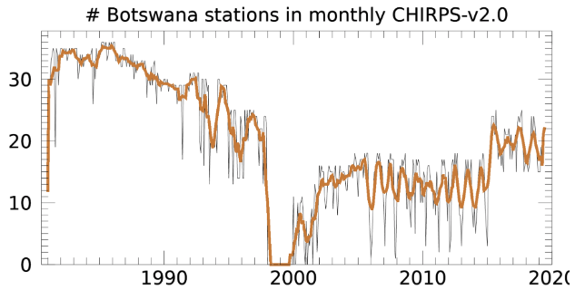
In addition to the spatial map, there is also a graphic showing the time series of station input to CHIRPS. This can show the trend in how many stations are reporting over time, and reveal where station support may be increasing or decreasing. These plots for each country can be found here. Additional versions of this same plot are made over a geographic region, and can be found here. This is an example of a time series plot for Botswana showing the changing support over time as different station sources have decreased their coverage and others have come online.